There are many reasons to value newspapers. One of them is their visual explanation of the news.
On-air media can convey the sounds and sights of events. Through a blend of text and imagery, print media can provide greater context and relevance to events, decisions, policies and trends.
Visual explanations, or infographics, have become more common in print media as editors and reporters strive to remain competitive and relevant in a world swelling with “breaking news”. No print media outlet does a better, more consistent job of visual explanation than The New York Times, as evidenced by its domination of “Pulitzer” awards for print and online infographics in competition with the likes of National Geographic, no slouch when it comes to captivating, informative visual art.
Once a staid tabernacle of reporting that shunned front-page pictures, the Times now routinely includes infographics on its front page and its website. The principles guiding visual explanations designed by the Times are instructive to anyone and any organization communicating to a diverse audience. Some of those principles are:
- Clarity of context – displaying information to show its relevance and significance.
- Respect for the reader – making complex material digestible through simplicity.
- Integration – seamlessly blending words and imagery, on a single page and over multiple channels, to tell a more compelling, convincing and complete story.
- Answering questions – a picture can answer questions by avoiding 1,000 words.
- Clear annotation – ensuring what’s shown is credible and understandable.
The most recent Sunday New York Times provides examples of the newspaper’s visual explanation prowess. On Page 16, it devoted a full page to an infographic showing how the liberal and conservative blocs of the US Supreme Court split on the nine most significant decisions in the last term, ranging from COVID restrictions and religion (5-4) to religion and gay rights (9-0). Online, the Times expanded its infographic chart to include public attitudes regarding each issue at the center of high court decisions.
The Sunday print edition also included a pair of infographics related to the condo tower collapse in Miami. The main infographic provided a close look at a crumbling, but still standing structural column contrasted with how the underground column was designed. The second infographic showed how the columns appear to have less steel reinforcement than called for in the design. The visual explanations were part of a news story about potential causes of the collapse and the reason experts are calling for an intentional demolition of the still-standing part of the condo complex, which occurred over the weekend
The back page of the July 4 Sunday Review section carried the full text of the Declaration of Independence, including an inset of the actual written and signed document.
Creating impactful visual explanations requires focus, commitment and at least some artistic sensitivity. They also demand rigor.
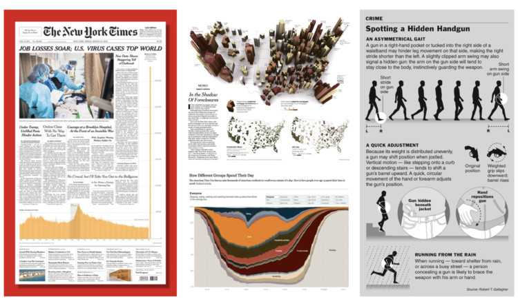
There are galleries of Times infographics that communicators can peruse to learn techniques and stimulate their thought processes on how to show a story by integrating words, imagery and interactivity. One of the best examples to study (see below) was the March 20, 2020 edition that coupled the lead story about soaring job losses and COVID cases with a chart plotting weekly unemployment claims. The chart showed the ebb and flow of claims from 1990 through the Great Recession to March 20. The 3.3 million jobless claims that week jutted from the chart located in the lower part of the front page to the newspaper’s masthead. The infographic gave stunning visual context to the story headline, “New data shows staggering toll of outbreak”.
No topic eludes visual explanation. The Times has published infographics showing the number of subprime mortgage foreclosures across the country, how Americans spend their days and a handy guide for spotting someone carrying a concealed handgun. A growing number of their infographics appearing online are interactive, which invites deeper viewer engagement.
Creating impactful visual explanations requires focus, commitment and at least some artistic sensitivity. They also demand rigor. The information or data portrayed should be accurate and applicable. Execution must be viewer centric. An infographic should be integrated as an essential part of a story or provide a comprehensive, stand-alone story.
There are tools that offer templates or guide creation of infographics, which can be adequate for the simplest visual explanation. It still is worthwhile to ask a graphic designer to polish your infographic to ensure image quality, color harmony and optimal design strategy.
Another approach is to create an inspiration image, using a simple drawing (stick figures are okay) or a collection of images you download from the internet. Take your inspiration image to a graphic designer who specializes in visual explanations for assistance.
Infographics are excellent examples of information by design. To capture eyeballs and inform minds in a crowded marketplace of content requires discipline, from mastery of a subject through perception of how best to tell a story to execution. Check out the CFM Information by Design Ebook for a deeper dive into visual explanations, including tips on how to enhance your content.