Visual Communications Impress and Inform Through the Eye
Music is universal because melodies resonate in human brains. Melodies for the eye can reach the same cerebral destination.
Musical melody relies on catchy repeated elements, logical progressions and a continuous relationship with the bass line. Likewise, melodies for the eye rely on fetching visual elements, logical order and clear linkage to the subject. The only difference is their external entry to the brain’s memory bank.
Songwriters create musical melodies. Visual communicators create melodies for the eye. But too often, professional communicators don’t consider their visual options to create melodies for the eye rather than run-of-the-mill flackery. It’s a huge missed opportunity.
Visual communicators lead the eye through content, much in the way a melody carries a song from beginning to end. Like an inviting musical melody, a visual story draws in the eye and leads it to a conclusion. Impactful melodies for the eye are easy to grasp and more likely to be remembered – the visual equivalent of an earworm.
Creating melodies for the eye requires more than simply throwing in stock art and icons to a fact sheet, backgrounder or presentation. The creative process starts with a clear sense of the intended audience, then selecting imagery, words and structure that convey key messages, with a touch of Imagination.
Melodies for the eye are possible in all forms of strategic communication from videos to PowerPoint presentations to fact sheets.
Visual communication is a form of functional art that relies on eye appeal to deliver intrinsic value. Functional art examples include beautifully designed, very comfortable Herman Miller chairs; elegant, easy-to-operate Nespresso coffeemakers and sleek Porsche sports cars that look fast and go fast.
Posters typify the traits of functional visual communication art. In a relatively confined space, posters make a statement with a dynamic blend of imagery and text with an impression that informs. Great posters are melodies for the eye.
Illustrated furniture assembly directions are less spectacular but just as effective at informing the eye on how to turn a box of parts into an electric standing desk. When you finish the assembly, you marvel at the desk and thank the visual communicator who made assembly easy.
Melodies for the eye are possible in all forms of strategic communication from videos to PowerPoint presentations to fact sheets.
Videos are a powerful medium that resonate with melodies for both the eye and the ear. With smartphones and apps like TikTok, you don’t need a production studio to create and share top-notch visual content. Professional communicators can go one step further to create video that captures an audience and packs an informational punch.
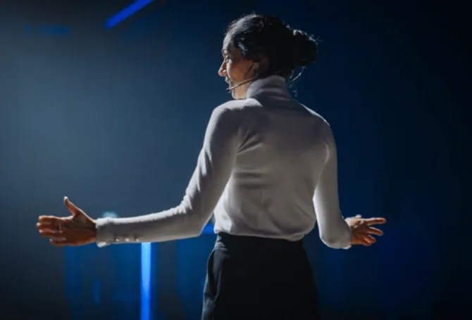
Presentations can stir dread in speakers. Throw aside the doubts and the bullet points and focus instead on creating a visually stimulating presentation that illustrates and underscores your key messages. A PowerPoint presentation is your sidekick, not your script.
Applying visual communication principles to print material requires a functional artistic attitude. The starting point is identifying what needs to be communicated. Next comes imagining how best to convey those key messages and to structure supporting information. Constructing the document should be guided by how to impress and inform, to stimulate and educate.
Many popular musical melodies are simple. Melodies for the eye should be simple as well. A fact sheet about wine labels could feature a page-size wine bottle image with minimal text linked to specific parts of the label. Viewers will see the picture.
Some subjects require more text for explanation, background and context. The job for visual communicators is to package the information for it is easy to digest through the eyes of viewers. The “art” may not be imagery, but graphic design that simplifies and reinforces the key message.
Charts are often overlooked as old school. However, a well-designed chart can serve as a compelling image that provides essential information economically. United Airlines ran a full-page ad with nothing more than a chart and its logo. The chart compared its lower fares to several destinations with those of rival airlines. Nothing more needed to be said.
The New York Times routinely carries informative charts on its front page that add depth to its reportage.
Visual communication can be aided greatly by great writing. Parallel construction is a simple technique to give a melodic touch to your writing. Some might call it hiding poetry in your prose. Wordrake offers a useful blog tutorial on how to apply this technique.
One example here will suffice from an AP obituary on the death of novelist Peter Matthiessen: “Much of his fiction, from At Play in the Fields of the Lord to Bone by Bone, bestowed a lion-like aura upon nature – grand when respected, dangerous when provoked, tragic when exploited.”
Almost any assignment of significance can be upgraded with visual communication. With enough practice, patience and skill, most workaday projects can be made to sing likes melodies for the eye.

Check out CFM’s Information by Design Ebook.